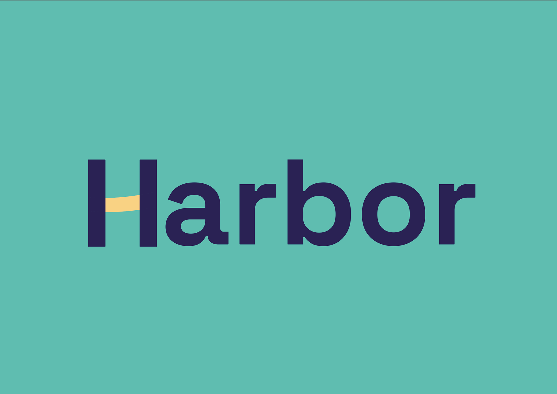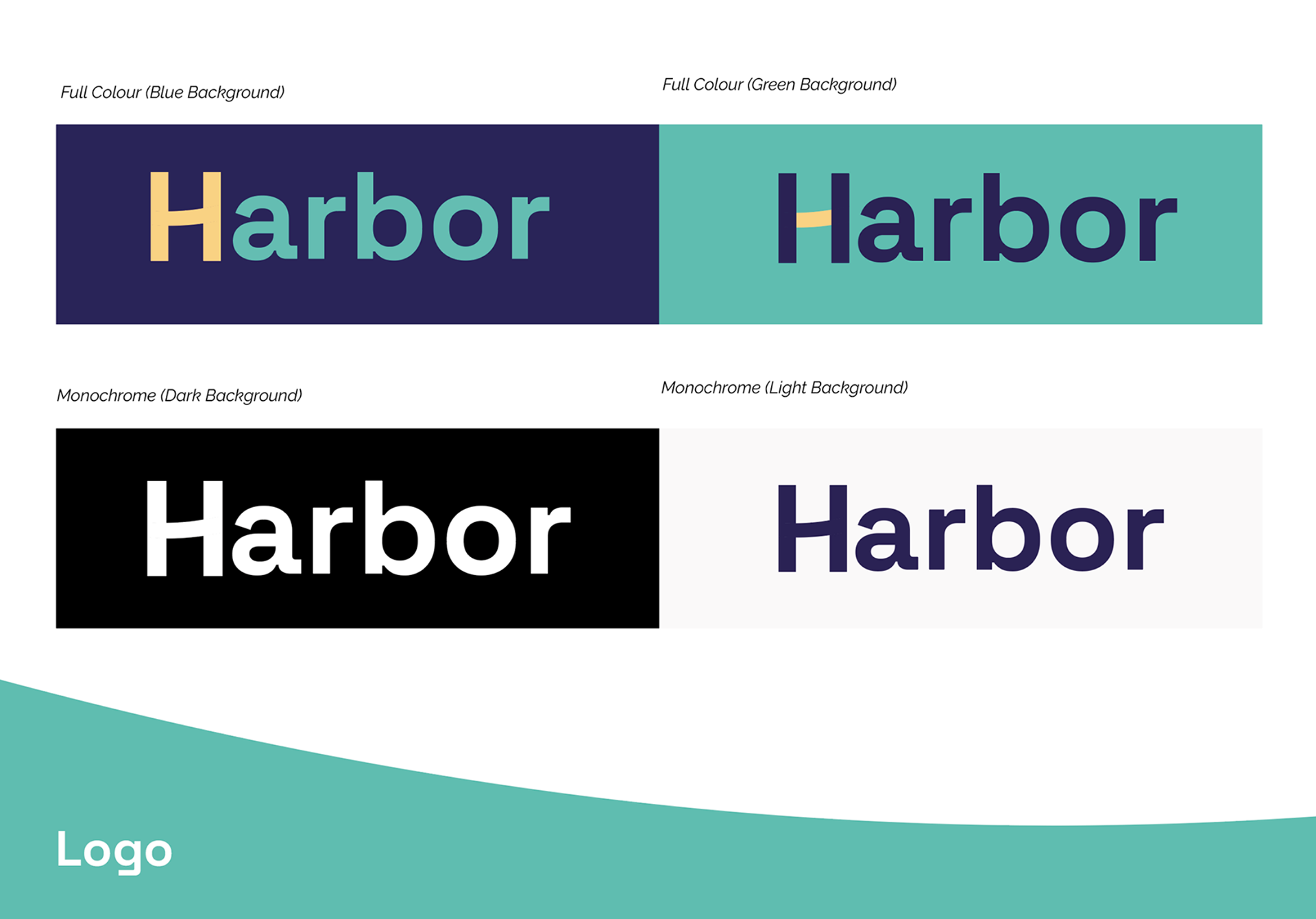
1. Concept:
• The nautical theme is subtly woven into the design through shapes, colours, and visual metaphors.
2. Typography & Structure:
• The typography choice is “Space Grotesk Bold” - to ensure there is some visual consistency with the main Datamaran visual identity.
• Structural elements resembling waves, reinforcing the idea of a fluid space.
3. Symbolism in the Brandmark Variations:
• The “H” reflects core values like stability (solid form), movement (waves), and connection (intersecting lines or shapes).
• The curved or layered elements within the icon symbolise water, tides, or pathways, reinforcing the nautical theme.
4. Color Palette & Meaning:
• The blend of blues, muted reds/pinks, yellows, and green - to encourage a warm, inviting community feel - but tie to the nautical theme.
5. Overall Visual Impact:
• The identity aims to ensure it resonates with the community-driven nature of the Harbor platform.
• It visually aligns with the idea of guidance and collaboration - both key elements of a thriving community platform.